Thursday 30 December 2010

Magazing & cover art.

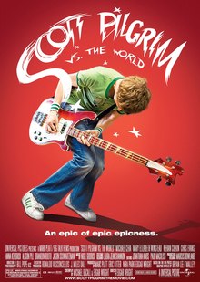
This is the advertisement poster from the movie Scott Pilgrim VS. The World. The reason i have chosen to upload this particular picture, was due to the way it is set up. firstly, the background is white, which makes all the other colours stand out to the consumer. Secondly, the main characters are shown in a split screen style at the top of the page; i plan to do the same design, but with the band in the background, whilst having the two rivals, Bethany and Emily, in the front, back to back, just like Scott and the main girl are shown here. I plan to do this design in the magazine and if possible, on the CD cover as well.

Wednesday 29 December 2010

Album Artwork research (2)

This is the first ever CD i purchased, i uploaded the pictures onto here, because it's very effective in my opinion. Firstly, the CD comes in another paper pouch which has the barcode and price tag on, which i think makes it look better value for the price you pay.

On the inside of the CD pack, you will find the Leaflet, which opens up to relevant advertisement and promotions, which may be interesting for the consumer, it'd be similar to a magazine, with different promotions, information and news about the band or company. Then you will find 2 CDs and a clever turn-able plastic sheet to put both CDs on the same plasti, but different sides of it.
This is a rather relevant piece of Digipak to me. I think this because firstly, it has no plastic cover, therefore better for the environment, which right there is a small slogan and seller to put on the back of the cover, as well as being very effective and colourful. The front background is shown to be black once again, which is typical and effective of Daft Punk to do so, but then they use images of their helmets, their signatures, to surround the album name.

The inside of the digipak is very simple, a small leaflet that tells you about the music on this CD, the CD, as well as the track listing on the back. Plus the barcode which every CD case has. This is by far, yet the most simple and effective digipak i have found.

This is 2001, one of the most influential albums created by Dr. Dre. the main theme in this album, which is displayed at every chance, is drugs. in particular, marijuana (dope, weed, grass, green, etc). The leafs are shown pretty much all over the casing or inside it even. on the front, the label presents the most famous tracks on the album, the name of the album alongside a marijuana leaf, and a shiny sticker with the name Universal on it, the label company for this album, it's pass of authenticity. Another feature is the Parental Advisory Explicit Lyrics sticker on the front to warn parents and guardians that this album is not suitable for minors.

Inside of the pack, there is the CD, with a Large marijuana leaf on it, as stated, the main theme. There can also be found a large leaflet that has information of the songs and producers and makers of each song.
On the back of the leaflet, there is a large collage of the pictures taken, within the 4 years of creating this album. this is very effective to show the consumers, the effort and time taken for this album. On the back of the album art cover, there is a track list as well as a barcode for shops to scan.


Album Artwork research (1)

This is one of the most famous and best selling Daft Punk albums within their careers. this is the front of the case, it's very effective in my opinion due to the very dark background (which daft punk seem to use a lot within their work) and then with a very peculiar graphics use for their title, it's a mercury substance based letters, which mark the album as Daft Punk's work, with a strange rainbow coloured glow on the outside of the letter. This makes it stand out and look very effective to the consumer.
On the inside of the pack, the CD, which has is black with silver writing, as well as the leaflet can be found. The leaflet has track information, the listings, the lyrics for each of the songs, how to get onto the Daft Punk online club, a picture of the band at work as well as a Poster for the album, on the other side of the leaflet. On the back of the album, there is a listing of the songs as well as a barcode for shops to scan.
This is the front of the Adulthood movie soundtrack CD. the photography is rather interesting. the way the actors are all positioned at the front of the digipak. it relates to the idea i have for my digipak.
This is the inside; on the left there is a booklet which is also in the next picture. The CD has been placed outside the pack to show what's underneath it, another picture.
The booklet has the name of each track, as well as scenes from the movie itself. The back of the casing is also shown, which has the track listing as well as the picture of the main actor from the movie, plus the barcode for shops to scan.


Monday 6 December 2010

update - monday 5th

Today is the first day back after the dreadful snow week which i was unable to get into the school. Within the last week, i have made multiple daily blogs to keep updated and also showing my research for the digipak. I have drawn some designs on paper which i will upload alongside the blogs i have done within the last week which i have not been able to upload from home. Over the past week, I have not been unable to shoot anymore, nor have I been able to edit my footage, as they were on the school network. Although i have a copy of all the footage on my personal computer, i do not have the software to edit the footage properly at home, the Premiere Pro is only available to me via the school network. Due to this weather, i will and the deadline being moved to this Friday for the rough cut, i will spend this week editing my video, staying after school to do so, just to make sure this meets the deadline. after the rough cut, i will start on my digipak, bringing it out of just sketches and creating a final piece to start my work on.